Sometimes I use this phrase “good book design.”
What do I mean?
The phrase “good book design” implies that there is such a thing as “bad book design,” and indeed (I believe) there is.
In a nutshell, good book design (cover and interior) will help connect the book with its audience.
“But isn’t it all subjective, like art?” you may ask. To some degree, yes: there is always some subjectivity involved (more, below). But (I would argue), mostly no.
Good book design (including the cover, but also including the book’s interior) helps accomplish the specific goals set out by the author/publisher (usually including selling the book). Which is usually selling the book to a particular audience. The design therefore, must connect the book with its readers.
For example, if your primary goal with your book cover is to express yourself and give a few books as gifts to your family and friends, then (seriously) have fun! You are a creative being and you will probably really enjoy the process of creating your own book cover design, and learn a lot. I highly recommend it. Absolutely whatever you decide is just perfect no matter what anyone says.
On the other hand, if your goal is to entice people so they may read, enjoy, and buy the book, then we’re in a new realm with completely new objectives.
If you want to sell books so that people can enjoy and benefit from them, then the book cover needs to accomplish the following objectives very quickly (at a glance), especially online where everyone is scanning all the time:
Orient the reader: working hand in hand, the title and the design must convey immediately what type of book it is. Hence, e.g., the word “novel” on the cover of most novels.
Convey credibility by demonstrating an adequate level of professionalism and avoiding any signals of “amateurism” that are widespread in self publishing. The very basics include principles of proximity, contrast, balance, repetition and more.
Attract the reader, by being intriguing – the most difficult design objective of all. All design has the potential to be clever, inspiring, delightful, beautiful, provocative and/or magical, signalling to the reader that this book is extra special and worth looking into, out of more than 1.4 million self-published books every year. Nowadays, an excellent book cover design is worth striving for, especially if you’re self publishing! If a book cover makes you pause and smile, bingo. It’s a first impression thing.
Is there still subjectivity involved? Absolutely!
Book design is complex and when it’s done well, it looks effortless. I’m going to repeat that but in a different way: good book design looks so effortless that it’s easy to believe that it’s easy. If you think this might be true, I highly encourage you to try it!
Of course, it’s in my vested interest to have you believe that it’s easy to mess up these objectives without professional guidance.
So I don’t expect you to take my word for it.
But it’s true. Messing up the book cover can potentially throw off any marketing efforts that follow.
There are exceptions. Imagine you’re a first time fiction writer publishing your book chapter-by-chapter for free on WattPad, in order to slowly grow a following. Although it’s still a great idea to convey credibility and professionalism with your book cover, your timeline/priorities may be different for that than if you’re launching a nonfiction business book on Amazon to boost your career and get speaking gigs.
As you may notice below, it’s much much easier to identify that a book cover is of a high professional standard than to explain why it is (or isn’t). There are good reasons for this! As consumers in a hyper-materialistic world, our eyes are bombarded every day by ultra high budget advertising campaigns. We can recognize good (and bad) design, without necessarily recognizing what makes it so.
Simply, book cover design is a specialized skill.
Book Design: Example time!
Let’s look at some book covers. We’ll start by training our eye to see the difference between “good” book cover design and “less effective” book cover design.
Recap: the book cover needs to orient the reader, convey credibility and be intriguing. The “how” of it all is a book in itself.
Example 1: Children’s books
These are just some random screen grabs. Go onto Amazon and review the bestsellers and you’ll see a lot of great book cover designs.
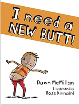
These book covers have great titles (the pre-requisite to an effective book cover) which are readable, even at thumbnail size. The typography is carefully considered, and tells us immediately to which genre the book belongs. The illustration is gorgeous, and everything is laid out in a harmonious way.
These are good.
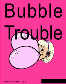
And these below (with the author names blocked off) are less successful. I’m willing to bet my first born child that no one buys them. They could be amazing books but we’ll never know.
Yes it’s the lack of sophistication in the typography etc., but in particular it’s also the lack of elusive objective #3 – intrigue. The sum of the parts. Which either add up to a pleasant experience, or not so much. It’s simple to see, but hard to do.
Example 2: Nonfiction Books
These are literally just random screen grabs from the business section on Amazon, but they orient the reader, convey professionalism, and in some cases, intrigue. The Simon Sinek book design on the right made me pause. That’s excellent design (and yet, it looks so simple, right?!).
And now below, less effective. I’m not trying to make anyone feel bad here, which is why I’m blanking out the author names.
Example 3: Personal Development
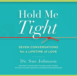
These are actually some of my favourite books. Good:
Less good (please forgive me if you happen to see your book here!):
Example 4: Novels
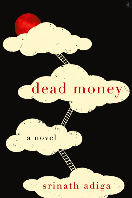
I think you get my point! I’ll leave you with some random beauties.
Conclusion
Whatever you end up with as the cover of your book, one thing is certain: you will have learned a heck of a lot through the process, and your next book’s cover can only get better!
However, if you are determined to put your best foot forward, make sure the designer you choose for your book cover is specialized in book design, and that you love their portfolio. There’s no point in hiring someone whose work doesn’t speak to you. That way you give your book the best chance possible to sell in a crowded marketplace.
At absolute minimum, any book cover must orient the reader to your genre, and convey the appropriate level of professionalism.
However, for best results, consider the importance that something really amazing can bring! Intrigue, humour, beauty. Intelligence. Qualities that only a really talented book designer can bring to your book.


